What does it take to spread an idea? To change people’s minds? One might think you need a marketing campaign with hundreds of words of copy. Perhaps you need to advertise, network with the right people, and relentlessly promote your idea online. But could it occur organically with a single image?
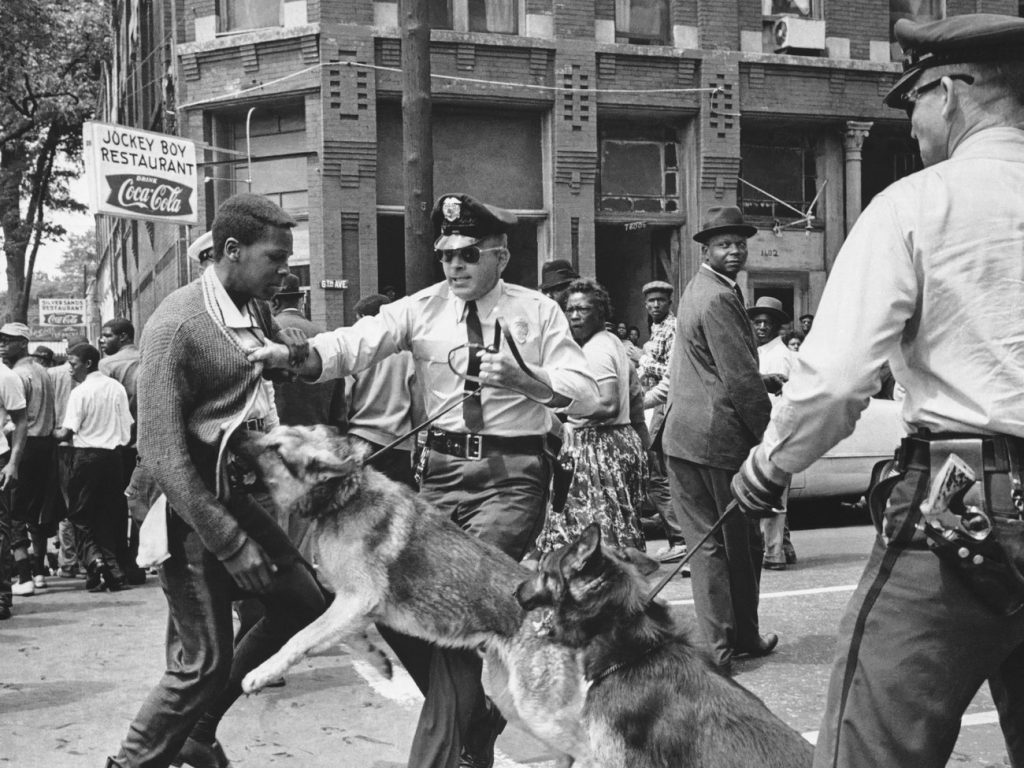
Maybe if you happened to be at the right place at the right time, like Bill Hudson happened to be in 1963 when he snapped Walter Gadsen, a student at Parker High School in Birmingham, being attacked by police dogs. That image appeared on the front page of The New York Times the next morning and arguably shifted public opinion about the civil rights movement. But that depends on the unpredictable timing of events that are out of your control.
What if the image was more subtle and reproducible? Can something we see every day, like graphic design, shift our biases towards a marginalized group?
A few weeks ago, I attended an exhibition at the Cooper Hewitt Smithsonian Design Museum in New York City called “Access + Ability.” It featured works of design by and for people with a “wide range of physical, cognitive, and sensory abilities.” The exhibit featured items like a smart cane that sends out ultrasonic signals detecting obstacles, bejeweled hearing aids, Nike-designed sneakers for people with cerebral palsy, and even an electronic shirt that takes sound as input and then translates it into vibrations for the deaf and hard of hearing so they can literally feel the music.
Among all the fancy gadgets was a simple graphic image that made me feel clever for understanding the underlying intent, while simultaneously impressing a novel perspective for me to consider. The image is an icon of a person in a wheelchair, leaning forward, arms bent behind. A person in a dynamic state, moving forward through space. Someone with things to do.
Designed by Brian Glenney, Sara Hendren, and Tim Ferguson-Sauder from 2009 to 2011, the Accessible Icon project served to reinvent the traditional International Symbol of Access, an icon of a person in a wheelchair, sitting upright and static, originally designed by Susanne Koefoed in 1969.
![]()
The Accessible Icon project began when Sara Hendren had the insight that the original symbol was not representative of people in wheelchairs. This set off a period of collaboration with Brian Glenney that eventually led to a street art campaign in order to spark conversation. They created stickers of their new icon and overlaid them on the traditional image on signs in parking lots and department stores.
Slowly, they began to receive media attention for their design activism. They partnered with graphic designer, Tim Ferguson-Sauder, to bring the image up to professional standards, as well as Triangle, Inc, an organization that advocates for people with disabilities, in order to promote the image. The artists made the image free to use as part of the public domain. As the media attention grew, Hendren writes that they used the
“media’s interest in graffiti’s legality to then shape our interviews to our own agenda: the politics of disability, access, and inclusion.”
Soon, the image began appearing in places as far ranging as the U.S. Department of the Treasury, a hospital in India, and even being accepted as part of the permanent collection at the Museum of Modern Art. The simple act of street art had turned into a symbol of empowerment and activism.
Alastair Faud-Luke, a Professor of Design Research at the Faculty of Design and Art at the Free University of Bozen-Bolzano in Italy, defines design activism in his book of the same name as
“design thinking, imagination, and practice applied knowingly or unknowingly to create a counter-narrative aimed at generating and balancing positive social, institutional, environmental, and/or economic change.”
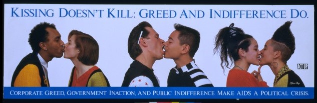
In other words, using design to change the people’s perceptions to create progress. Historically this has been seen in graffiti art throughout the world and even in the ACT UP campaign for AIDS awareness: “Kissing doesn’t kill. Greed and indifference do.” Nowadays, we are seeing this in the variety of clever signs we have seen at the Women’s March and the Never Again movement recently.
What I find remarkable about the Accessible Icon is that it did not need to be abrasive when it first began appearing. Nor did it occur at a politically charged moment. Instead the artists altered signs without defacing them. They astutely used a transparent sticker so that people could see the old and the new images. It caused people to consider an alternative viewpoint without overtly telling them what to think. Seeing the image made me feel like I had internally generated an original idea, which is probably a far better way to get people to change their minds. Make people think they came up with it on their own.
Despite all the lip service towards innovation, it often feels like change in healthcare continues to spin its wheels in the mud. But design thinking can be applied to make subtle changes that might nudge people to rethink preconceived notions and make better decisions about their care.
A well-executed graphic design is enough to start a public health movement by improving our public spaces. Perhaps it takes redesigning patient intake forms to make them easier to use, making airline safety cards easier to read, and even reminding providers to wash their hands with a strategically designed sign. It starts with observation. Finding the right problem to solve. And the courage to make change through execution. Forward movement through space, if you will.